top of page

Our Projects & Portfolio

GG's Garden

GG's Garden

GG's Garden had outgrown a dark, hard-to-read brand built in Canva. We gave founder Ericka Padilla-Toro, known as The Ganja Goddess, a bright "urban oasis" identity rooted in her Puerto Rican heritage, with a Flor de Maga logomark, botanical patterns, and a palette as vibrant as she is.

The Treasure Box

The Treasure Box

A boutique dispensary in the heart of the West Village needed a brand as culturally and historically rich as the neighborhood around it. We gave it a new name rooted in the building's history, an Art Deco identity, and an interior designed with Anderson Porter, opening in late 2026.

MAVZ

MAVZ

Named after the founder's son, MAVZ brings quiet luxury to the Massachusetts wellness market. We designed the wordmark, colors, product names, and more. The launch has since tripled the founder's revenue compared to his previous brand.

Hazy Bear

Hazy Bear

Pine forests, loons on the lake, and a town that likes things just the way they are. That's where Hazy Bear Herbery calls home, so its new brand and interior concept borrow from vintage National Park art to feel familiar to Outing, Minnesota locals and irresistible to summer visitors.

Rhi-Up

Rhi-Up

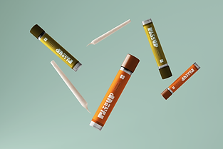
Founder Rhiannon Binder named Rhi-Up after herself, with a nod to re-upping your stash. Her brand pairs a 60s-inspired logo of interlocking letters with the earthy palette and romantic linework of the 70s, now showing up at women's events and on her sweatshirts, tees, and stash bags.

MĀSK Skincare

MĀSK Skincare

MĀSK Skincare had already been featured in Forbes, Harper's Bazaar, and Refinery29 and loved by names like Bethenny Frankel and Thalía. In 2023, we refreshed its serum, oil, and balm packaging with a clear hierarchy and stronger contrast for shoppers online, in retail, and at luxury spas.

Five More Minutes

Five More Minutes

Sleep so good you'd beg for five more minutes. That feeling inspired our CBD sleep concept, a full lifestyle line wrapped in soft blues, purples, and pinks with a dreamy script logo, stretching from gummies and tinctures to candles, robes, slippers, a dream journal, and a full bedding set.

Wave Blends

Wave Blends

New owners, a new name, and new formulas called for a whole new look. When Wave Naturals became Wave Blends, we built a fresh identity made to win over direct-to-consumer shoppers, with swirling water-inspired labels, custom nature icons for each product, and a new landing page.

Glisten

Glisten

CBD beauty is still finding its footing, so we built Glisten to show where it could go. This lip oil concept, named and designed in-house, shimmers with gradients of purple, pink, blue, yellow, and gold across packaging, merch, social, and retail displays made for beauty's biggest shelves.

DabScience

DabScience

We built DabScience from the ground up, from brand strategy to packaging design and sourcing. Delicate alchemy-symbol linework and Prohibition-era style collide with a bold yellow-orange and deep blue palette, made to stand out on dispensary shelves in Massachusetts and now New Jersey.

Nuage

Nuage

In 2021, hardly any rolling paper brands were made for fashion-forward women. Founder Andrew Nunes wanted to create a brand for just those women. We named it Nuage, French for "cloud," and designed every piece, from a custom logo and a color palette to packaging and a website.

Wave Naturals

Wave Naturals

Wave Naturals came to us for refreshed CBD packaging. Calming wave patterns and separate day and night designs gave its bestselling tinctures a fresh face, and the refresh helped catch the eye of a local dispensary that bought the brand and brought us back for its next chapter.

Wildess

Wildess

The nostalgic smell of campfire smoke, cool night air, and nowhere to be. That's the feeling behind Wildess, a camp-inspired cannabis concept we named and built from scratch, from the logomark and brand patterns to packaging and print collateral.

High Standards

High Standards

Made for wellness-minded women and millennials ready to swap the cocktail, High Standards is our concept for a hemp-derived THC aperitif. Art Deco glamour and golden-hour light shape every can, bottle, web page, and business card, proof that a cannabis drink can hold its own at any bar.

LYT

LYT

We created LYT to prove a grunge, counterculture cannabis brand can look modern on any dispensary shelf. This concept brand comes to life through a custom wordmark, retrofuturist linework, and packaging finished in holographic green, orange, and purple foil.

bottom of page